5 highly effective Nano Banana Pro prompts you can use
Author: Aakash Gupta
Nano Banana Pro is the most amazing AI image model ever. It’s opening up brand new uses cases that you need to know.
But let me break a harsh truth: most people are lying about what Nano Banana Pro can do for you. It still sucks for professional headshots, for instance.
I’ve tested everything so you don’t have to. Here are 5 actually awesome prompts that can be useful to (and aren’t silly annotations that are useless):
1. LinkedIn infographics
You can now turn complex thoughts into shareable infographics.
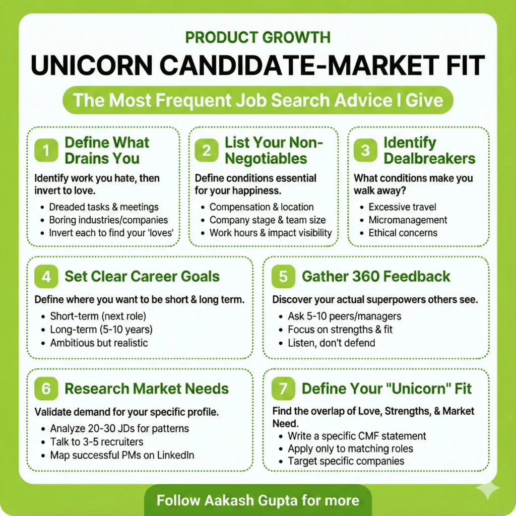
I created the above with this simple prompt:
Create a lime green and white infographic with:
- Top: Category label, bold title, subtitle in bubble
- Middle: 7 numbered steps in dotted boxes (3-row grid)
- Each step: Green number pill, bold header, explanation, bullets
- Bottom: Green banner with “Follow me for more”

Use #A4D65E green for headers/accents, white backgrounds, black text, rounded corners. Keep text concise and mobile-friendly
{blog-content}
2. Create technical diagrams
You can now create complex technical diagrams:
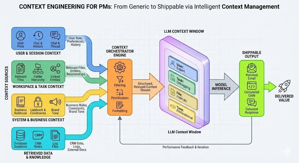
Create a professional technical diagram illustrating [SYSTEM/PROCESS]. Use clean, modern styling with appropriate icons and labeled components. Include [KEY ELEMENTS] and show the relationships between them with directional arrows. Use a color scheme that distinguishes between [DIFFERENT SYSTEM PARTS]. Make the diagram clear enough for technical documentation but visually appealing enough for presentations.3. Comparative product UI mockups
It can easily show you how different design approaches for a feature can look side-by-side, so you can make better decisions and have a solid foundation to work with.
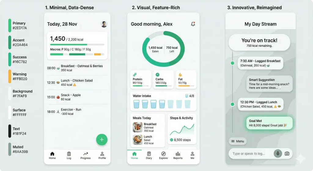
Steal this prompt:
Create a set of 3 UI mockups for {FEATURE/SCREEN} showing different design approaches. For the first, use a minimal, data-dense design prioritizing efficiency. For the second, create a more visual, feature-rich interface. For the third, design an innovative approach that reimagines how this interaction could work. Use a consistent color palette based on {BRAND COLORS}, and include realistic placeholder data. Make each mockup distinct but implementation-feasible.4. Visualize data patterns and anomalies
AI can finally do charts!
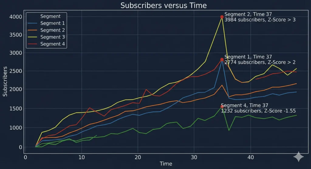
This is great for sharing or for visualizing large datasets sitting in your Excel sheets:
Create an advanced data visualization highlighting the patterns and anomalies in this [DATASET/METRICS]. Use visualization techniques that reveal [SPECIFIC RELATIONSHIP] while making [KEY ANOMALY TYPE] immediately apparent. Incorporate small multiples or comparative elements to show changes over [TIME PERIOD]. Use a color scheme that emphasizes statistical significance, with attention to accessibility. Include annotations pointing out the three most important insights.5. Transform code into visual explanations
When you need to explain complex algorithms or code logic to stakeholders or in documentation without losing them in technical details, this comes in handy.
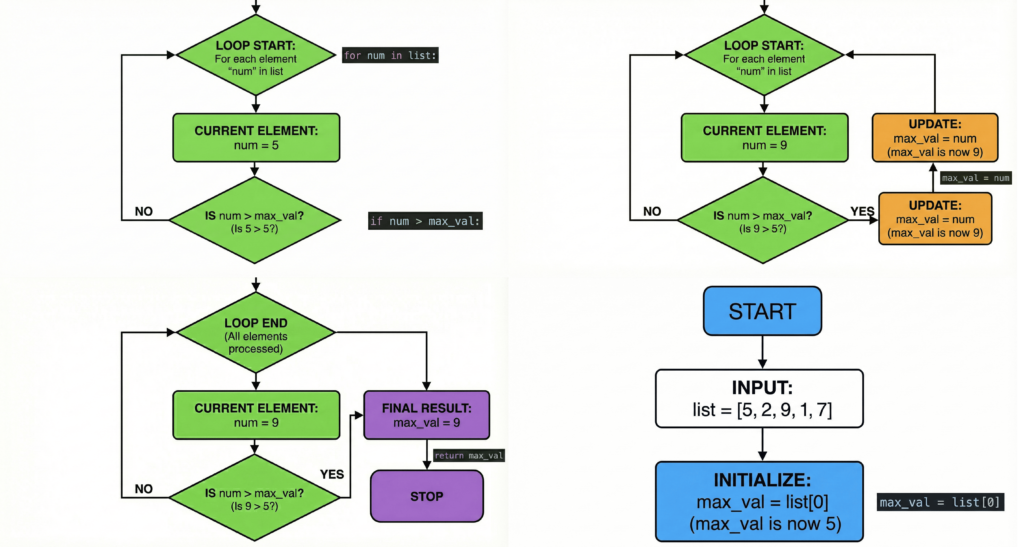
Steal my prompt:
Create a visual explanation of how this [ALGORITHM/CODE BLOCK] works. Use a step-by-step flowchart with clear annotations explaining each operation. Include small code snippets where relevant, but focus on making the logic visually intuitive. Use color coding to distinguish between [DIFFERENT OPERATIONS/PHASES]. Make the visualization detailed enough for engineers but clear enough for non-technical stakeholders.Share this post
Related Posts

Getting Started with Google Antigravity
Introduction In this codelab, you will learn about Google Antigravity (referred to Antigravity for the rest of the docum...


Google Antigravity updates rate limits: Pro/Ultra get priority access, free tier moves to weekly quotas
The official Antigravity account announced via three tweets: Pro and Ultra users now receive priority access and more ge...